


What happened?
Twelve years!
You hit me with a cricket bat!
Ha! Twelve years!
Twelve years!
You hit me with a cricket bat!
Ha! Twelve years!
Sunday, February 05
Design Refresh
I'm doing a new design for the next version of Minx, based on the 960.gs / Skeleton / Bootstrap CSS layout libraries.*


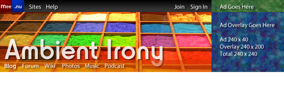
 Update: Damn arithmetic! One problem with the above layout is that to fit ads neatly in the sidebar you'd want it to be 240 pixels wide - the same as the ad itself. But the maths just doesn't work out.
* Most likely Bootstrap; I had some issues with version 1.4, but the newly released 2.0 cleans up most of the things I didn't like and adds even more features.
I'm doing a new design for the next version of Minx, based on the 960.gs / Skeleton / Bootstrap CSS layout libraries.*
The rounded corners are likely to go at this stage; form design will improve, and blogs will resize (at least in theory) to fit your device, but in discrete steps rather than one pixel at a time.
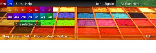
The idea is that you'll choose a 12- or 16-column layout, and then assign a certain number of columns to each element on the page, so you might choose 12 columns, and allocate 8 to the content and 4 to the sidebar. But you could also have a headlines area (between the banner and the content) with three items each four columns wide.
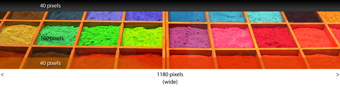
The new base widths will be 700 pixels (for smaller devices like tablets and phones), 940 pixels (for older PCs and notebooks), and 1180 pixels (for larger screens). All of those work out evenly whether you choose a 12- or 16-column grid.
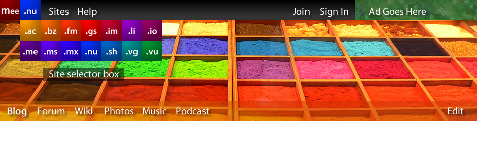
There will be a pair of new, interactive menu bars above and below your banner image, the top one for the mee.nu system as a whole, the bottom one for your site. The current ads (which I haven't sold any of yet anyway) will shrink down to fit in the top menu bar, rather than sitting above it, and will expand out on mouseover. I think that's the best compromise to make them as unobtrusive as possible while still giving advertisers a useful amount of space.
Sample Images

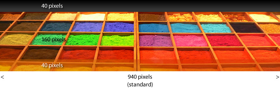
With a 940-pixel standard layout, you have 12 columns each 60 pixels wide, and 11 margins in between each 20 pixels wide. 12 x 60 + 11 x 20 = 940.
With 16 columns, it's 16 x 40 + 15 x 20 = 940.
This works because we're ignoring the rightmost 20-pixel margin - if we included that, the widths would be 720, 960, and 1200 pixels - all multiples of 240, with lots and lots of useful factors.
So if you have a 3 column sidebar in a 12-column layout, that's 3 x 60 + 2 x 20 = 220px. 4 columns in 16-col layout is 4 x 40 + 3 x 20 = 220px. Either way, too narrow for the ad. 4 columns in 12-col layout is 4 x 60 + 3 x 20 = 300px; 5 columns in 16-col layout is 5 x 40 + 3 x 20 = 280px, which leaves a fair chunk of space over.
I'm not sure how bad that will be in a live design, so I'm not going to tear up the fundamental principles of mathematics just yet. And you could force the sidebar into a 240-pixel layout within a 280/300 pixel division if need be, with a larger than normal gap between the sidebar and the main content.
Real-world testing is indicated here.
Posted by: Pixy Misa at
10:04 AM
| Comments (4)
| Add Comment
| Trackbacks (Suck)
Post contains 547 words, total size 4 kb.
<< Page 1 of 1 >>
41kb generated in CPU 0.0456, elapsed 0.2012 seconds.
51 queries taking 0.1754 seconds, 196 records returned.
Powered by Minx 1.1.6c-pink.
51 queries taking 0.1754 seconds, 196 records returned.
Powered by Minx 1.1.6c-pink.