Say Weeeeeee!
Ahhhhhh!
Ahhhhhh!
Thursday, August 09
Coffee And Banners
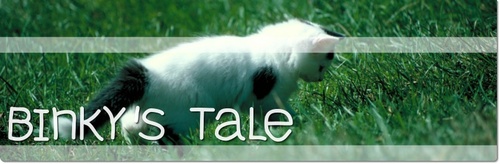
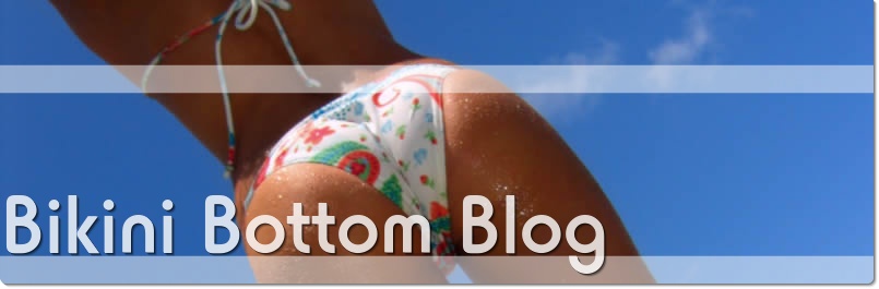
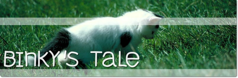
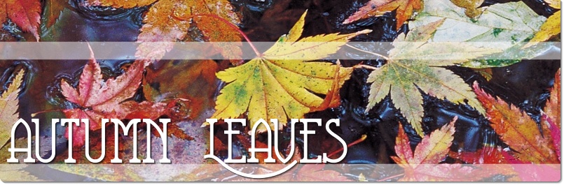
Showing off some of the more advanced text styling features:

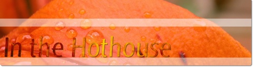

Since I don't have time to produce an extensive library of text effects, I've just added a feature to create the text from an image. The Morning Coffee example actually uses the kitten image for its text - and vice versa.
If you use an image for your text, the system can't (yet) automatically defringe shadowed text. Manually setting the background colour to orange did the trick for the Hothouse example.
As usual, click for biggie-size.
Showing off some of the more advanced text styling features:


Since I don't have time to produce an extensive library of text effects, I've just added a feature to create the text from an image. The Morning Coffee example actually uses the kitten image for its text - and vice versa.
If you use an image for your text, the system can't (yet) automatically defringe shadowed text. Manually setting the background colour to orange did the trick for the Hothouse example.
As usual, click for biggie-size.
Posted by: Pixy Misa at
11:05 AM
| No Comments
| Add Comment
| Trackbacks (Suck)
Post contains 89 words, total size 1 kb.
Nor Snails Nor Slugs Nor Glom Of Nit...
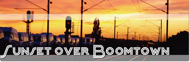
IT WORKS!!!
Now admittedly I've spent most of today yesterday on subpixel optimisations, because that's what I do (and because at typical monitor resolutions, subpixel optimisation matters). It's so cool when you nudge this to the left by exactly half a pixel and that little artifact just POP and disappears.
I still have to finish putting together the page that lets users access this, and note that I did spend a minute or two cropping these images rather than letting the system do it automatically. But all the effects are applied by the system with a single function call.
Typical generation time is 300 to 400ms on the test system.
The final two problems were both related to drop shadows: Removing the fringes on shadowed text without affecting anything else, and removing artifacts from the shadows on the rounded corners, which were generated by overlapping shadow sublayers. That one was an example of a half-pixel nudge.
There are a lot of subtleties that aren't immediately apparent. The text has a dropshadow. The shadow isn't just gray; it actually darkens the pixels underneath. It has to precisely follow the contours of the text, but never show through the text, even though the text itself is partly transparent. (Technically this is wrong; the opacity of the shadow should be multiplied by the opacity of the text and the resulting fainter shadow should show through. In practice though, this looks terrible.) The text has to be anti-aliased with the background and with the shadow, and the outer edge of the shadow has to be anti-aliased against the background as well. And because the shadow is composited with the background using itself as a mask, you have to actually use the square root of the desired opacity when drawing the shadow.
Little things like that, but you know when you've got them right:

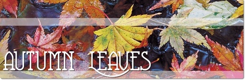
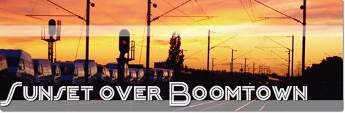
(Click for biggie size.)
The menu text, ad and logo are overlaid by the browser, so they don't show in these samples.
These don't showcase all the features yet; I'll work up some more examples once I have the user interface up and running.
IT WORKS!!!
Now admittedly I've spent most of today yesterday on subpixel optimisations, because that's what I do (and because at typical monitor resolutions, subpixel optimisation matters). It's so cool when you nudge this to the left by exactly half a pixel and that little artifact just POP and disappears.
I still have to finish putting together the page that lets users access this, and note that I did spend a minute or two cropping these images rather than letting the system do it automatically. But all the effects are applied by the system with a single function call.
Typical generation time is 300 to 400ms on the test system.
The final two problems were both related to drop shadows: Removing the fringes on shadowed text without affecting anything else, and removing artifacts from the shadows on the rounded corners, which were generated by overlapping shadow sublayers. That one was an example of a half-pixel nudge.
There are a lot of subtleties that aren't immediately apparent. The text has a dropshadow. The shadow isn't just gray; it actually darkens the pixels underneath. It has to precisely follow the contours of the text, but never show through the text, even though the text itself is partly transparent. (Technically this is wrong; the opacity of the shadow should be multiplied by the opacity of the text and the resulting fainter shadow should show through. In practice though, this looks terrible.) The text has to be anti-aliased with the background and with the shadow, and the outer edge of the shadow has to be anti-aliased against the background as well. And because the shadow is composited with the background using itself as a mask, you have to actually use the square root of the desired opacity when drawing the shadow.
Little things like that, but you know when you've got them right:
(Click for biggie size.)
The menu text, ad and logo are overlaid by the browser, so they don't show in these samples.
These don't showcase all the features yet; I'll work up some more examples once I have the user interface up and running.
Posted by: Pixy Misa at
01:24 AM
| Comments (3)
| Add Comment
| Trackbacks (Suck)
Post contains 361 words, total size 3 kb.
41kb generated in CPU 0.0869, elapsed 0.1725 seconds.
51 queries taking 0.1588 seconds, 197 records returned.
Powered by Minx 1.1.6c-pink.
51 queries taking 0.1588 seconds, 197 records returned.
Powered by Minx 1.1.6c-pink.